Arkin
Previously known under a different name, Arkin set out to build a new chapter with Toby Ng Design by forming a new name and assembling a new brand identity system. As a construction solution, design and build company, Arkin aims to streamline the entire construction process for residential places, from inception to completion.
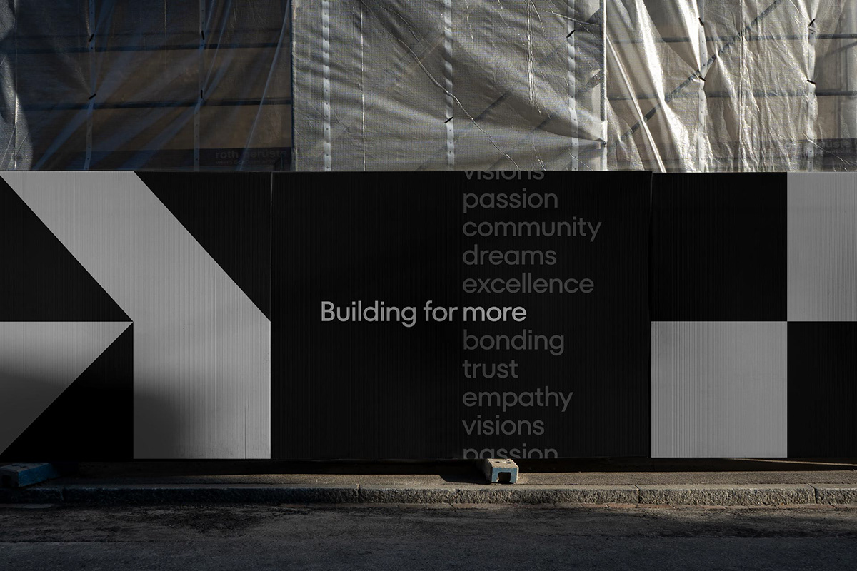
Rooted in a family business ethos, Arkin is built on human relationships, cherishing connections with clients, employees, and contractors. The company culture, centred around empathy, is encapsulated in the name – a blend of ‘ark’ and ‘kin’, symbolizing the ark of kinship, building bonds beyond buildings.
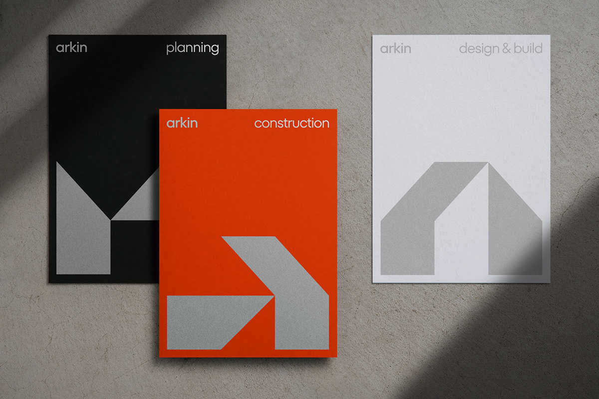
The Arkin logo, an abstract representation of the letter ‘A’, embodies the core business values while also depicting the image of a house and an ark. This logo transforms into a dynamic pattern language that resembles various styles of houses, forming the backbone of the visual identity with a professional and trustworthy brand colour palette. The identity system effectively communicates Arkin’s flexible business model and the diverse collection of house-building work, with the aim of revolutionizing the perception of the construction industry.


The Arkin logo is an abstract representation of the letter ‘A’, incorporating the shape of a house. It transforms into various patterns, each symbolizing a unique style of houses. This ownable language enriches the brand identity system and embodies Arkin’s commitment to diversity and adaptability in the housing design and build market.